- Read Tutorial
- Watch Guide Video
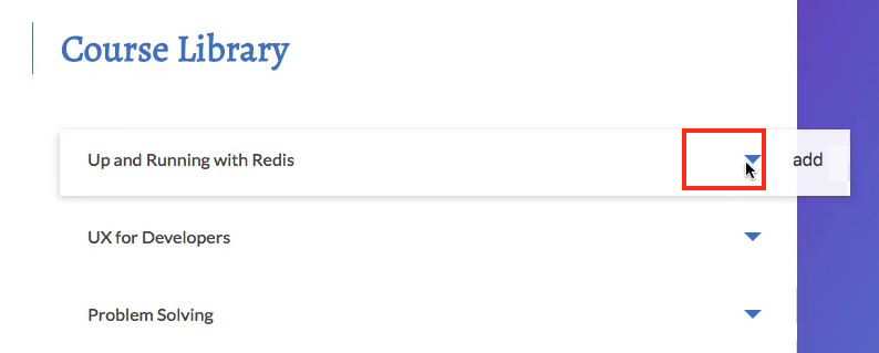
The way we can do this is by adding some styles to our courseLibrary.scss and a div into our courseLibrary.js so it animates when you remove it and it animates back in when you add it and you see it has a nice effect.

So the way we can do this is by first putting a div next to our title. The reason we're are putting it in this container here is so that it will fit right next to our title because we have a width of I think it was 85 percent on this. So we don't want to put it after the title because then it would appear right here.

So we want it to be right next to the title. So it's going to be right in the container with it. So it's going to be part of the 85 percent width and it will come right after the title. Let's go ahead and type out this div here and we're going to want to give it a class name in back tics of course check mark.

The reason we're going back tics is because we need to animate it based on whether or not we are enrolled in the class. So go ahead and type out the course.enrolled in our courseLibrary.js and if we are enrolled in it I want to give it a class tag of show content fade and if we're not enrolled I want to give it a class of hide content fade.
<div className={`course_check-mark ${course.enrolled ? 'show-content-fade' : 'hide-content-fade'}`}></div>
So we need to add styles to course_check-mark show content fade and hide content fade. So save that and we shouldn't see anything in the browser because there's nothing in our div. So we're going to be doing this purely in css if you were to put something right here.

You would be able to see that here

but we don't want to do that. And you'll notice that it's right up next to it. So the first thing we want to do is give it a margin left of about 20 pixels. So let's go ahead and go to our courseLibrary.scss and let's start typing out these tags so we have course_check-mark and then we have show content fade and then we have hide content fade. The first thing we want to do is use the after selector in our check mark and then we can give it a content we want this to be blank. So this is to give it another block level of blank space so we can actually add in this arrow effect here and we have to type in block to do that as well. So the next thing we want to do is make it kind of a rectangle except for we want to rotate it so we can kind of have that check effect except for you'll notice that it's going to be on both sides because it's an entire rectangle.
I'll show you what I'm talking about here so width 10 pixels height of 20 pixels and let's give it that margin left of 18 pixels that we were just talking about.
.course_check-mark {
    &:after {
        content: '';
        display: block;

        width: 10px;
        height: 20px;

       margin-left: 18px;
    }
}
The reason we're doing that is to push it over to the right a little bit. So then again let's rotate it, I'll save it and then we'll see what it looks like without it rotated and you won't see anything. That's because we need to we could give it a background color. All right so you'll see that.

Now we want to rotate this and then kind of cut it in half that way we can get a checkmark and then we're going to end up getting rid of the background color and we will just apply it to the border so it's only the border. I'll show you what I'm talking about right now. So transform rotate 45 degrees and it should rotate it.

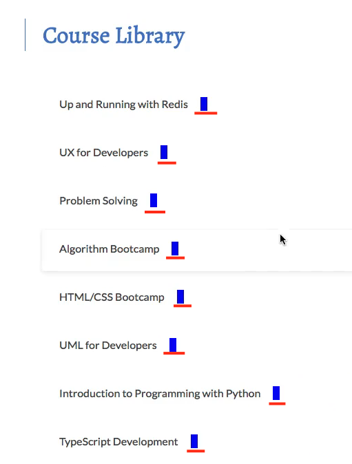
All right so now kind of think about what I'm trying to say here. We don't want the background color in here. And we don't want this top part. We just want the border of the bottom here and the right here which should give us a check mark effect. So let's get rid of the background color so it's not a block. And then let's give it a border of solid and color #487bce and then let's give it a border width of zero 2.5 pixels 2.5 pixels and zero. This should get rid of the border on the top here and the right.
.course_check-mark {
    &:after {
        content: '';
        display: block;

        width: 10px;
        height: 20px;

        margin-left: 18px;
        transform: rotate(45deg);

        border: solid #487bce;
        border-width: 0 2.5px 2.5px 0;
    }
}
And then we got rid of our background color and then we gave the border a color of #487bce which is giving us the check mark we want.

Now if you click on add you'll notice nothing happens because we haven't applied anything in these classes so if you go to our courseLibrary.js it's switching these show and hide content fades properly but we don't have anything in here so nothing's happening. So if we're enrolled show content fade and if we are not enrolled hide content fade. So let's just say OK well when we show it we want an opacity of one. And when we hide it we want an opacity 0.
.show-content-fade {
    opacity: 1;
}

.hide-content-fade {
    opacity: 0;
}
So if we go in here you'll notice it's working now

but it's not animating the way we want it to and it's super easy to do this all we have to do is type in transition all .2 seconds ease and that should animated it out.
.show-content-fade {
    opacity: 1;
}

.hide-content-fade {
    opacity: 0;
    transition: all .2s ease;
}
So if I hit remove it fades out but if i hit add it doesn't animate in that's just because we haven't added that to the show content fade.
.show-content-fade {
    opacity: 1;
    transition: all .2s ease;
}
Now to get it to slide in and scale up a little bit. All we have to do is type in transform scale .8 and let's say translate x minus 10 pixels. That way it will pull it back 10 pixels to the left and it will scale it down about .8 as it disappears.
.hide-content-fade {
    opacity: 0;
    transform: scale(0.8) translateX(-10px);
    transition: all .2s ease;
}
Ok awesome so that's working great. So the reason we don't need to add in transform in here is because the default value is going to be scale 1 and translate 0. So it's going to go where it needs to go when we come here. We probably don't even need opacity because once this is taken out in our course library once it applies this tag and this is no longer applied that opacity is no longer zero and it should go back to its default values.
So that is it for the check mark. Let's commit our code and then we'll quickly talk about what we're going to do in the next guide. So git status, git add ., git commit -m you shouldn't have any changes in your main.scss as I have just fixed a typo up here before the video and that's why mine is modified. But let's commit so git commit -m "added course check mark styles" and then let's push this up, then let's edit our list in our main.scss.
So in the next guide, we will implement the add and remove Button styles, so the styles that we need to put here. If you look at the design we have those styles right here. So we need to add in this plus and the x. So let's go ahead and do that in the next guide, I'll see you then.