- Read Tutorial
- Watch Guide Video
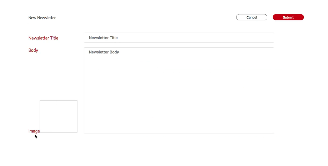
So it's 137px by 160px for that image. So let's go into our form-fields.scss and let's scroll down to the bottom and add in our selectors.
form-fields.scss
//IMAGE
.form-image {
    &__title {

    }
    &__image {

    }
}
Now our title is pretty much exactly the same as it is on the text area and the titles we have already, and I don't want to throw the image in with the other selectors because we don't have an input, and it would give us a lovely bunch of random styles that we aren't even using. So what I'll do is make a mix-in.
form-fields.scss
.form-input,
.form-textarea {
    &__title {
        @include red-title;
    }
So let's make it in a file called mixins.scss and paste in our mix-in styles.
mixins.scss
@mixin red-title {
    color: $color-red-BA;
    font-size: 1.8rem;
    font-weight: 500;
    line-height: 2.3rem;
}
Okay now we're going to import this in our main.scss.

Now we can include our mix-in for our image title.
form-fields.scss
//IMAGE
.form-image {
    &__title {
        @include red-title;
    }
    &__image {

    }
}
Now we have the right title for our image and we didn't have to write anything. We want to make things as reusable as possible in our code, because it makes things easy in the future. Now, what we need to do is add in height and weight for our image. Remember, the width was 160 and the height was 137.
form-fields.scss
//IMAGE
.form-image {
    &__title {
        @include red-title;
    }
    &__image {
        width: 16rem;
        height: 13.7rem;
    }
}
Let's see if it did anything.

Now what we need to do is fix up the grid because you can see that the title is right beside the image box. So we need to position the pieces.
form-fields.scss
//IMAGE
.form-image {
    display: flex;
    flex-direction: column;
    &__title {
        @include red-title;
    }
    &__image {
        width: 16rem;
        height: 13.7rem;
    }
}
What we need to do now is give it a little bit of a gap with a margin. If we were using CSS Grid, we could create row gaps, but since it's flex-box we have to do something like margin. Let's check our design.

Let's add that in.
form-fields.scss
//IMAGE
.form-image {
    display: flex;
    flex-direction: column;
    &__title {
        @include red-title;
        margin-bottom: 2rem;
    }
    &__image {
        width: 16rem;
        height: 13.7rem;
        border: none;
    }
}
We also made sure that a border wasn't showing up. Chrome will put a border around it to show you that something's there, but it actually has no border.
So we need to do is put in a placeholder image. So we got to think about how we want to put this data in because in the future we want an image to just flow directly in that form when we have data come through. This goes for the title and the body as well. And that's kind of a whole different thing.
So what we'll do is not wait on that and we will put in the input to actually upload an image. So we want to learn how to upload image now. So let's go into formFields.js and we need to put in an input.
formFields.js
export class FormImage extends Component {
    render() {
        const { className, title, input, type, imageUrl } = this.props;
        return (
            <div className={`${className} form-image`}>
                <label className='form-image__title'>{title}</label>
                <img
                    className='form-image__image'
                    src={imageUrl}
                />
                <input {...input} type={type}/>
                {/* replace button/input goes here */}
            </div>
        )
    }
}
This will look a little ugly, but as you can see, we have a choose file button.

It's what we need to get this to work, but we get a couple errors from it. So let's go ahead and commit our code and in the next video, just to kind of separate these a bit so you can take a minute and breathe, what we need to do is we need to make this button work and we need to style it so it's in the middle like it is in this design.
git status
git add .
git commit -m "form image styles"