- Read Tutorial
- Watch Guide Video
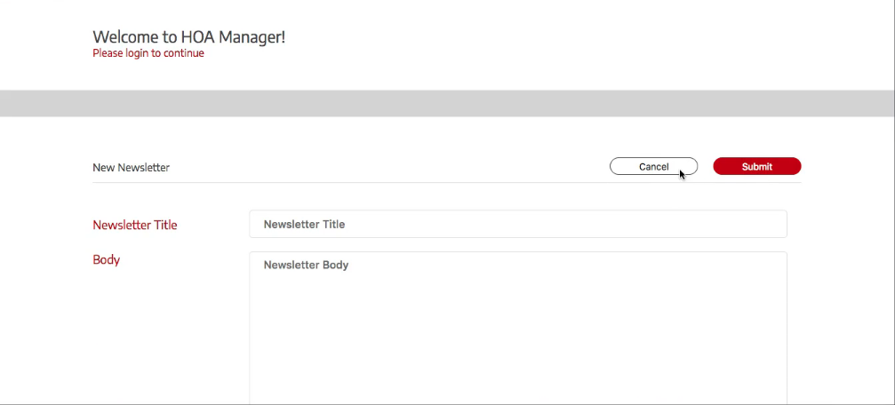
Welcome back to the course. In this video, we're going to make it so that when we click on these buttons, we don't have an outline appear. You'll notice that the login screen also has this and we don't want that.
So let's go into our code in form-fields.scss and let's add in styles to get rid of the focus.
form-fields.scss
.form-button,
.form-button-small {
    &__button {
        &:focus {
            outline: none;
        }
    }
}
That should fix it. Let's test it out.

You'll see now that when we click these, nothing happens. There's no way to tell that we're actually clicking these except for our console logs. So, we'll want to add a little bit of an animation to it, but we only want this to happen when we click on the buttons. Down below is an article with the different css selectors we can use. (link below)
So let's go in here and add in an active selector with our transition.
form-fields.scss
.form-button,
.form-button-small {
    &__button {
        transition: all .2s ease;
        &:focus {
            outline: none;
        }
        &:active {
            transform: scale(0.95);
        }
    }
}
Now what I want to do is move it down a bit so that it looks like it's in the same place at the bottom. So let's add in a y movement in our transform. To figure out how many pixels we need this to move, we can take the height of our button, which is 41px and multiply it by 0.05, which is the distance changed by our scaling. That gives us 2.05px. Let's put that in.
form-fields.scss
.form-button,
.form-button-small {
    &__button {
        transition: all .2s ease;
        &:focus {
            outline: none;
        }
        &:active {
            transform: scale(0.95) translateY(2.05px);
        }
    }
}
That'll put it down the amount we want. Okay so you can mess around with that and do whatever you want, but this is nice because it doesn't have that nasty selection color and it gives us a cool little animation. We don't have it on our normal buttons that aren't form buttons, though.

I'd like to also have the animation on those buttons too, but they're changing the page faster than our animation, so it doesn't really matter. Let's just move on because that's not really what we're trying to focus on here. We want to get the functionality in.
So basically what we want to do before we move on with this newsletter form is add in the image. Let's go in the next video and throuw in an image and put it in place on the grid.
Let's commit our code.
git status
git add .
git commit -m "button animations"
git push origin master
I'll see you in the next video.