- Read Tutorial
- Watch Guide Video
Let's go into our newsletterGrid.scss, and we want to do is copy all of the grid styles inside of it, and then go into newsletter-detail.scss paste it in here. We then want to clear out some of the data we don't need.
newsletter-detail.scss
.newsletter-detail {
    grid-row: content-s/content-e;
    grid-column: content-s/content-e;

    justify-content: center;

    display: grid;
    grid-template-rows: [add-s] 4.7rem [add-e s box-s] 16rem [box-e archive-s] 1fr [archive-e e];
    grid-template-columns: [box-s archive-s] 16rem [box-e archive-e latest-s] 960px [latest-e];

    grid-column-gap: 6.1rem;
}
Let's go to our browser, and you'll see that it's aligned nicely.

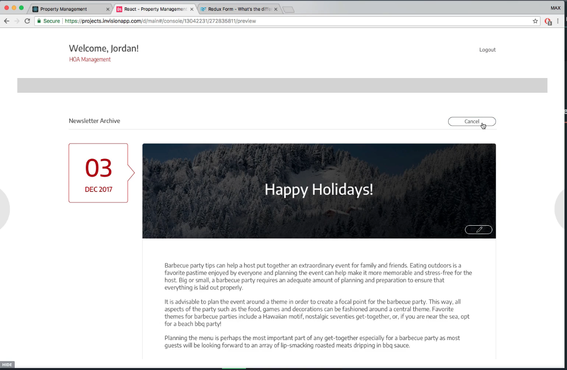
That's the power of reusing components. Now you'll see that in the design there's more content. There's a title and a button.

Let's add those in real quick. All we have to do is go into our newsletterDetail.js and import these in.
newsletterDetail.js
import React, { Component } from 'react';

import { connect } from 'react-redux';
import * as actions from '../../actions';

import NewsletterBox from './newsletterBox';
import NewsletterLatest from './newsletterLatest';

import { FormTitle } from '../formTitle';

class NewsletterDetail extends Component {

    componentDidMount() {
        this.props.fetchNewsletterWithId(this.props.match.params.id);
    }

    render() {
        console.log(this.props.newsletterToEdit);
        return (
            <div className='newsletter-detail'>
                <FormTitle className='newsletter-detail__title' text='Newsletter Detail'/>
                <NewsletterBox date={this.props.newsletterToEdit.date}/>
                <NewsletterLatest {...this.props.newsletterToEdit}/>
            </div>
        )
    }
}

function mapStateToProps(state) {
    const { newsletterToEdit } = state.newsletters
    return { newsletterToEdit };
}

export default connect(mapStateToProps, actions)(NewsletterDetail);
With form title, we're actually importing a function, and not a class, so we had to write it with import { FormTitle } from '../formTitle';
Now we have to provide our title with a spot on our grids and fit this in a little bit better. So what we'll do is go to our newsletter-detail.scss, and we need to provide title inside of this.
newsletter-detail.scss
.newsletter-detail {
    grid-row: content-s/content-e;
    grid-column: content-s/content-e;

    justify-content: center;

    display: grid;
    grid-template-rows: [title-s] 50px [title-e add-s] 4.7rem [add-e s box-s] 16rem [box-e archive-s] 1fr [archive-e e];
    grid-template-columns: [box-s archive-s] 16rem [box-e archive-e latest-s] 960px [latest-e];

    grid-column-gap: 6.1rem;

    &__title {
        grid-row: title-s/title-e;
        grid-column: 1/-1;
    }
}
Let's go to our browser and look at it.

That looks a little bit better, but let's look into our newsletter-new-form.scss and see what styles we're using, and just copy those.
newsletter-detail.scss
.newsletter-detail {
    grid-row: content-s/content-e;
    grid-column: content-s/content-e;

    justify-content: center;

    display: grid;
    grid-template-rows: 100px [add-s] 4.7rem [add-e s box-s] 16rem [box-e archive-s] 1fr [archive-e e];
    grid-template-columns: [box-s archive-s] 16rem [box-e archive-e latest-s] 960px [latest-e];

    grid-column-gap: 6.1rem;

    &__title {
        width: 100%;
        margin-top: 6.6rem;
        grid-column: 1/-1;
        grid-row: 1;
    }
}
In our other components, the title mostly just flowed into the tp spot of the component, but we need it to match our design, so we set it to 100px, and you can see that it matches our design very well.

Okay. Now one thing I want to do is get it to line up with our title because it's not lining up. Let's just comment out our justify-content: center;. Let's also take out the archive calls since we don't have an archive in here.
newsletter-detail.scss
.newsletter-detail {
    grid-row: content-s/content-e;
    grid-column: content-s/content-e;

    display: grid;
    grid-template-rows: 100px [add-s] 4.7rem [add-e s box-s] 16rem [box-e] 1fr [e];
    grid-template-columns: [box-s] 16rem [box-e latest-s] 960px [latest-e];

    grid-column-gap: 6.1rem;

    &__title {
        width: 100%;
        margin-top: 6.6rem;
        grid-column: 1/-1;
        grid-row: 1;
    }
}
Yeah that fixes it. You'll see that the margins are working still.

Now, we copied this from our dashboard, and it looks like there is a gap here as well, and I want to take out the justify content here and see what that does. If it mess it up too much, then I guess we'll leave it in.
Now, it lines up a lot better it looks better, but the problem is now our content is over too far to the left. So if we make our screen wider, it's going to keep everything to the left, instead of having it in the center. Let's leave the justify-content in there, because it will keep everything centered for different screen sizes, and that's a better solution.
newsletter-detail.scss
.newsletter-detail {
    justify-content: center;

    grid-row: content-s/content-e;
    grid-column: content-s/content-e;

    display: grid;
    grid-template-rows: 100px [add-s] 4.7rem [add-e s box-s] 16rem [box-e] 1fr [e];
    grid-template-columns: [box-s] 16rem [box-e latest-s] 960px [latest-e];

    grid-column-gap: 6.1rem;

    &__title {
        width: 100%;
        margin-top: 6.6rem;
        grid-column: 1/-1;
        grid-row: 1;
    }
}
So anyways, let's commit our code.
git status
git add .
git commit -m "cleaned up newsletter detail grid"
I'll see you in the next video, where we'll finish it up by putting in the cancel button, which I forgot to throw in there. Super simple but we'll do in the next video.