- Read Tutorial
- Watch Guide Video
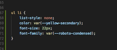
In the last guide, we implemented the Happy Birthday message which is displayed when you select the current date or wait for the countdown to finish. So let's get around to the styles here. So we're going to need to style this list and this is a big reason I use the list tags the list elements HTML so we didn't have to add more class names. So the first thing we want to style is the list elements in the unordered list and let's get rid of these dots here so list-style: none; and then let's give it a color of yellow so we can get yellow on the days, hours, minutes, and seconds so var(--yellow-secondary); again those are located in the base file here so you can kind of see how we've got these values.

All right save that and we'll wait for this to reload. All right sweet it's yellow and it looks really really clean. Let's go ahead and give it a bigger font-size: 22px;. All right that's nice and I don't think this will change anything but we'll see what happens when we hit font-weight: normal;. Yeah, nothing happened so let's just get rid of that. All right so font-family well let's just copy it from up here to roboto-condensed. If it's not inheriting that already and let's see if we can just inherit it all right tt's not so nothing above this has roboto. So let's save that
ul li {
    list-style: none;
    color: var(--yellow-secondary);
    font-size: 22px;
    font-family: var(--roboto-condensed);
  }

and let's get around to the numbers in here. So this goes back to why I actually changed this to have paragraph tags if you go to the birthday form or the clock form rather the clock component. You'll see we have paragraph tags in here. And the reason I did this is so we could kind of override the styles that the list tags are giving us when we are putting the styles on with the with the list tag here the list element. So let's go ahead and do the same thing but with paragraphs so it's gonna access our paragraph tag or paragraph elements instead of our list elements and we can style those however we want. So let's go color: white; save that. Awesome! That looks really clean in there. Everything's fitting this isn't as clean. Yeah, it's looking really nice this time around. So color white let's give it a font-size: 90px; and give the same font family let's actually see if it looks any different ok that's without the font family. Let's add in roboto. It didn't change anything and that's probably because it's inheriting it from yeah that's why it's happening so let's delete that and let's give it a line-height: 115px;. All right so that pushes that down a little bit. Okay and that should be it for the clock here. Let's try and pull it down a little bit because that looks a little high so we can do that with the line-height and it might not look as well though. Okay, let's change that back to 115
ul p {
    color: white;
    font-size: 90px;
    line-height: 115px;
  }
and let's do this let's pull the entire list down so yeah we can also apply it on the countdown clock style so we could say let's see what the values are on that. All right so we have top 50% we could just say top 55% and that pushes that down a little bit. Let's apply these styles directly to the tag we have up here just to keep it a little bit cleaner. Let's change this to 52%.

Yeah, that should be good. Okay so that pushes it down a bit and it looks like it's pretty centered well and yeah let's end it there for this guide in the next guide we're going to get into styling this the date picker down here you see in the bottom left of my screen. And then we should be done we might have a few other things to add a few little things but that should be the majority of the app so let's go ahead and commit our code and end the video so
git status
git add .
git commit -m "added in remaining countdown clock list item styles"
git push origin master
I will see you in the next guide.