- Read Tutorial
- Watch Guide Video
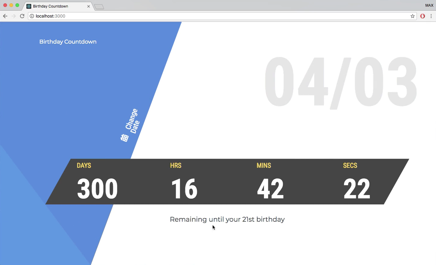
Now, since I'm on a bigger screen I didn't catch this error, but I looked at it on a 13-inch screen. If you are also on a 13-inch screen you will notice that it scrolls like this, which is kind of cool but it's obviously not what we want.

It's not a good user experience. We want it to fit on the screen, so let's just fix that really quick. Let's go to our base.scss, and the problem is we have 11 columns and 150px at the minimum. So it's minimum 150px. That's a problem because 150 * 11 is larger than your screen. It overflows, and you have to scroll.
What I want to do is not cut this down, but just kill one of the columns. So it's just 10. Then what I want to do is go throughout and change a couple of the columns. Let's go to picker.scss first, and let's change this 10 to a 9.

Then let's go to button.scss, and let's change this 10 to a 9.

Then let's go to clock.scss, and change this 11 to 10.

Finally let's go to our largeText.scss, and change this 10 to a 9.

If you go back, you'll see that we now have another problem. It's this. Pretty clear what's going on here, but we can fix it pretty easily. All we have to do is remove some the spacing on our grid for the clock.

Go back to clock.scss, and let's change this grid-column-gap to 10px. Now go back and it should be good. You'll see that it fits a lot better. Feel free to mess around with all of these values. You don't have to do it like I do it. In fact, I recommend that you mess around with it, because it will teach you how things can work.

For example, I changed this 2px, and it brought it a little closer. You could get rid of it entirely if you want. Just do what you feel is the best, and you will move on and learn faster as a developer.
Right now I noticed that we should make it a little higher. So I'll change the height in clock.scss to 85%. That might make it look better. So just go ahead and mess around with things, and customize them to your liking, that's the purpose of that.
The idea isn't to exactly replicate all of these. It's actually more valuable if you build off of them and make them your own. You will learn how to code better that way. Anyway, that fixes up some of that styling. Some of those issues.
Let's go ahead and move on to the next video where we will continue building on the functionality and then once I'm done with that, we will fix a couple more CSS bugs. I really want to get into that functionality.
Let's commit our code. Let's hit command + j in VS code. Let's say git status, git add ., and I want to just say git commit -m "style fixes". I'm going to push it to Github, so git push origin master. I'm not going to push it up to Heroku. I don't really care to do that right now. Let's move on and finish the functionality in the next few videos.