- Read Tutorial
- Watch Guide Video
In the last guide, I forgot to push up our code to GitHub. So I did that after the video so if you are following along I definitely recommend that you push up your latest commit with what we did on the Sign-Up page.
In review, this is what our Sign-Up page looks like. I think this is coming along nicely.

Now in this guide, we're going to try to get through two views. So we're going to try to get through login and then also forgot your password.
Now for the most part these are pretty basic. The only one change we're going to make is, notice how small these are? I don't think this would look very good if we had the full width that we have for the sign-up and for the edit account page. So I'm going to show you how you can override the card width because by default the cards in Bootstrap go the full width and so I'm going to show you how we can make a much more narrow one and follow best practices while we're doing it.
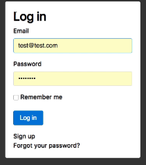
Let's start on the login page. If I open up sublime I'm going to close out of new.html.erb, I'm going to keep application.scss open, I'm also going to close out of edit.html.erb
So if you go to app/views/devise/sessions/new.html.erb this is our login page. So right here we have for the most part everything that we need but we're going to implement a few wrapper classes. So first one is going to be DIV and this is going to be of class and this is something a little bit different. We're going to create a new class called login. And the reason for this is because we want certain styles where we want to override our cards but we only want to override the cards that are inside of the login class. That's very important because if we simply overrode the card class then we would go and we would actually change the width because remember we want to make these ones a little bit more narrow. If we just went and performed an override on the card class styles then it would affect the Sign-up card it would affect our Edit card and it would have who knows how many other effects throughout the rest of the application.
That's one of the cool things about Cascading Style Sheets is we have the ability to pick and choose which items and which styles we want to override and which ones we want to keep. So this is a class that we have not created yet but we will do that as soon as we've set up our structure. So I'm going to create another one so it's going to be div class and this one's just going to be of card type which is you know what we've already done before.
<div class="card">
And now inside of that, we're going to implement one more.
Now this one is going to hold our card block. Now if we take a look at what we did with registrations you remember how we have this card block class this is what gives us our specific styles for our text and our alignment and all of that cool stuff. So here we're going to say class card block and now everything is going to be able to fit inside of here.
Your code block should look like this
<div class="login">
  <div class="card">
    <div class="card-block">

    </div>
  </div>
</div>
So I'm going to cut all of this out and including our log in text. Coming up here paste it all in and then just select everything indented so that everything is nested inside of these elements.
<div class="login">
  <div class="card">
    <div class="card-block">
      <h2>Log in</h2>

      <%= form_for(resource, as: resource_name, url: session_path(resource_name)) do |f| %>
        <div class="form-group">
          <%= f.label :email %><br />
          <%= f.email_field :email, autofocus: true, class: 'form-control' %>
        </div>

        <div class="form-group">
          <%= f.label :password %><br />
          <%= f.password_field :password, autocomplete: "off", class: 'form-control' %>
        </div>

        <% if devise_mapping.rememberable? -%>
          <div class="form-group">
            <%= f.check_box :remember_me %>
            <%= f.label :remember_me %>
          </div>
        <% end -%>

        <div class="form-group">
          <%= f.submit "Log in", class: 'btn btn-primary' %>
        </div>
      <% end %>

      <div class="auth-links">
        <%= render "devise/shared/links" %>
      </div>
    </div>
  </div>
</div>
Now we come back here hit refresh. You can see we're getting closer. Still not exactly what we need but we're definitely making progress.
First and foremost like we've already done several times is these field and the action items need to be changed to the form group class. So that's going to be the first part. And then each one of these items each one of them and not the checkbox so only the password in the email field. These need to be of class and this is going to be of form-control.
Now our button here that says log in. This is going to be of class Button and this should be button primary. You can go with any of the color buttons that you want to go with. But let's see what this looks like. That's looking much better still though this looks way too wide for what we're looking for. And we also have this text still in white.

So let's fix that first. I do a div here and we make this of class auth-links which is what we already created and now we can go slide this inside of it. See if that fixes it. And it does.
Notice here how the Sign-up and Forgot your password are aligned to the left in this case. That is what I want and if we would have in the last guide when we redid this link here if we would have gone and changed all of our off links and had them aligned to the right then we would have some conflicts here. So that's why it's very important to be selective with the styles so everything is good.
Now we simply have to shrink this cards width. So how would we do that? Let's come into the application.css file and give ourselves some room, give ourselves a lot of room, and then I'll clear it up when we're done just so it's easier to see.
And so what I'm going to do. Remember when we created this class of .login? now a very cool thing that you can do with css is you can nest styles inside of classes. So here I can say .login so I'm selecting our login class right here, and I'm going to say for any of the card classes that are nested inside of a login and you use this greater than character(>) to do that for all of those. I want these styles.
So I want the width to be 22 REM. Now, this is going to shrink the width and if I come back here hit refresh. You can see that that has been shrunk. But this looks a little weird. This shrink said but it shrinks it and goes all the way to the left. That's not quite the behavior we're looking for.
I want to have this card right here in the center of the page so we can also override a few other items so I can say margin and say zero auto. Then from there I can say float none. And lastly I can say margin-bottom and we'll see if this is what we need. We may or may not need to play around with it but let's see if we can say margin-bottom 10 pixels.
.login > .card {
  width: 22rem;
  margin: 0 auth;
  float: none;
  margin-bottom: 10px;
}
Let's see if this does what we want at hitting refresh. There we go. That looks much better. I'm not sure if we need this margin-bottom let's go in inspect it really quick. So one of the very cool things about the Inspector tools is you don't even have to make code changes you can simply inspect these items and then take a look and see if it's something you want to change or not. So here you can see we can click on login we could click on card and this card inside of login has the styles that we just created. And you can see this right here. Now if I click on margin-bottom 10 pixels means it barely has any difference. That's something I've used in another project so I and I brought it over. I think we really need it for this one. So I'm going to hit save. Get out of that. And now if I hit refresh. This looks perfect.

This is doing exactly what I want. Now make sure that it's all functional. Hit log in and we're good to go. So we only have one more devise view to get through. So let's get to it.
Next one is going to be forgot your password. So right here.
This doesn't look very nice.

So let's come and let's essentially populate all of that. Everything that we did with what we have here. So I'm going to go up to view and layouts and go with two columns and right here I'm going to open up passwords and new.html.erb And we might as well do passwords.edit
While we're there. You're not going to see passwords, not at it. Because this is the page that a user will see if they actually click on send me my password instructions. What will happen is an e-mail be sent to them, they can click on the link to reset it and they'll be taken to another page.
One common thing that I've seen happen is someone will fix the forgot your password view and make that look nice but then they'll forget to fix the actual page so that the user sees when they click on the link.
So I'm going to open both of those up here and we will take care of them as well. So now that we have these side by side we can simply come here and update these Let's come and we'll also copy the closing divs and indent everything just like that. So now that we have all of that taken care of now we can go and for our fields change these two form groups. And grab our cool little form control items.
And this is going to be just for password and password. And then change your password. Let's grab our handy button text right here. Then our auth links need to be covered as well. And that should be everything that we need there we have form controls, form groups, everything there should be good. We'll need to test it when we actually have hooked up an e-mail server where we can go and see what this looks like. Now let's do the same thing here and this is one we will be able to see right away. So I'm going to pace that in and then paste our three divs.
Like I said the way that I want it to kind of process all of this was we went very slowly in building out our styles in the first guide for the edit user account. And now I'm going faster because they're essentially already built we simply need to populate them here. If you're having any issues with this simply pause the video and analyze the code and see you know if you're missing some closing tags or you're forgetting to put the form control items on here. You know something like that. It's perfectly fine if you've never done this before. You know experience a few things that take a little while.
So that is a form group. This is the form control class and this button needs to be some type of button. And for this one, i'm going to say button secondary just so we have a button that looks a little bit different. And then lastly. Not that you use this div. And here we're having our cool auth link styles. And now let's come and hit refresh. There you go.

Worked the first time. Now send me my reset instructions. You can see that this style looks like it kind of gets overridden so buttons secondary may not be the best option for this one. Let's switch to button primary. There we go. And one other little issue. It's totally up to you if you want to fix or not but notice how this goes almost all the way. I don't really like that. I think it would make more sense to have it stretch all the way there. And the way you can do that is by saying button block.
Now if you hit refresh There you go.

Now it's stretched all the way and the only reason it's that long is just because the text here is that long. But usually what I'll do is if the button is about 98% of the same width as the field I'll just pass and Button block and then it'll stretch all the way and look a little bit cleaner.
So let's take a look at that. We have Login, sign up. All of these are looking really nice they're all functional. We also have our edit and hopefully are able to see how easy it is. I know that took a little while but I can promise you if you went and you had to build all of those styles from scratch. It would have taken about five times longer. So that is good.
We now have a pretty decent chunk of our portfolio designed. We still have a lot more work to do obviously to style our blog and our portfolio. But just in getting all of our devise components styled was quite a project.
So I'm going to say git status, git and git commit and this will be "Finished initial styling of devise pages". gIt push origin design.
git status
git add .
git commit -m "Finished initial styling of devise pages"
git push origin design
And we are good to go.
In the next set of guides and I am not breaking this into different sections because I want our design section to be its own dedicated section but essentially you could think of these almost like subsections. So all of these past guides so far have been for our initial layout. Our main application layout in our home about me contact pages and then all of our sign pages. Next, we're going to get into how to style our blog so that's going to be another set of styles it's a completely different layout and we're going to walk through how to implement that. So I will see you then.