- Read Tutorial
- Watch Guide Video
I'm not sure about you but I am incredibly excited with how this application is coming and I'm personally excited because part of my plan for this is actually to transition and make this my new portfolio site. I'm going to be using this in real life and assuming that you're following along and you're wanting to do the same thing you will as well. I think it's really exciting.
Just to give you a little bit of background, especially if you're newer to Rails. This is not a trivial thing. You don't usually find portfolio sites that have multiple layouts usually you have one single kind of layout like a WordPress kind of site that has different pages on it and things like that. Usually, you don't have one set of layouts for your About Me section, and Home and then a completely different one for your Blog and then another one for the Portfolio.
You should be very happy with how that is coming along because that is not something that is a small feature that's actually very significant. There are plenty of Rails apps that don't have that kind of functionality that is awesome.
Let's continue on in this next little subsection. We are going to get into our portfolio and how to customize this.
Switching to the finder you can see that here we're in the blog and if we go to the examples we can see all of our different kinds of options. Remember these are what we downloaded directly from Bootstrap. I'm going to click on album.
Before I do this I'm going to also open up Sublime. I'm going to close out of everything we did on our blog and I'm going to make sure that I have closed out of these files and that is all I have open for Sublime because I want to make sure there's no confusion. Kind of like we ran into a couple videos ago where I had the blog and the initial homepage layouts open.
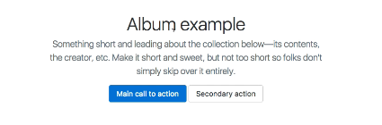
Now that we have this let's take a look at the album just to refresh our memories. This is the layout for our portfolio

I think this is really cool with my very favorite part being this little cool animated drop-down. Then they have some call to action buttons and some cool things like that. Then we have our actual portfolio items. Now one thing we are going to have to pretty much just kind of design from scratch is what the portfolio show page is going to look like because they don't have anything for that for their album, this is just the only page they have in it. But that's not a problem at all. It'll be a good exercise to see how we can create that from scratch and we can play around with a few different options. But what this is going to be is more of a set of guidelines that we can follow for building these out. The one thing I do like is they use the three by three grid pattern which is exactly what I personally want to implement. That will be good and pretty much everything else looks like something that's going to fit for our portfolio.
Let's come back to the finder. I'm going to open up both of these by right-clicking, clicking open with Sublime Text. This is going to pop both of them up and drag it so it's a little bit easier to see. Let's take a look at what we have. We have all of our same kind of things that we've seen before and we're going to follow the same pattern where we copy our viewport and our character_set and let's come and open up our portfolio layout, put that at the very top. Once again the viewport, this is going to make it possible to implement responsiveness later on. You don't really have to worry about it. You can just put it in right now. This is something specific to responsiveness and how we can make our application dynamic. If it's accessed on a smartphone or tablet it will be able to pick up what is called the viewport and what that means is it can adjust and say Ok, someone is viewing me from a smartphone or from a tablet and then it can adjust accordingly.
That's all that is, now inside of our portfolio and let me hit save and also come to the terminal. I'm going to start up the Rails server so that we can see exactly what our portfolio looks like right now and then we can come watch it in action as it is being built out. I'm going to come over to portfolio and this is where we're at right now and we can also adjust the sizes you can see 350 by 200 is the default placeholder we have and they have 356 by 280. You can adjust the sizes however you want. I'm going to follow what they have here because I think that works nicely. Everything else looks pretty standard. Let's come back and now let's see the next thing that we want to do. We have our stylesheet and let's just bring this over now. We know we're going to have to do it anyway. I'm going to copy this, let's go to 'assets/stylesheets/portfolio' and make sure right underneath bootstrap to put this in and hit save.
We're not going to see any change right now nothing significant at least because we haven't implemented any of the HTML. Let's continue doing that. I will close out of the CSS. Moving down you can see that we have our tag and now we have each one of these components. This is kind of like our masthead. This is this part,
which I'm going to call our masthead you could call it your header, whatever you want to call it but that is what that is.
I'm going to just cut this and let's switch over into our portfolio.html.erb. I'm going to get rid of our notice and alert and following the same pattern as before I'm going to create some comments I'm going to say "start of masthead". Then I'll put "end of masthead", hit save and that one should be good. Coming down this is the start of the album so as you can see right here where it says album

let's go and see what that looks like in the browser. Here it says album example and oh you know what it looks like I made a small mistake. It looks like what I just originally copied over was not the masthead but it looks like it may have been the navbar. Let's take a quick look at this. I've not gone through this previously because I wanted to go through it exactly like how you would go through it or like how I would do it from scratch. We're going to learn how to implement this together.
Just to see the way the order is. This is the navbar so the other item appears to be the masthead. Let me actually hit undo really quick just to make sure that I have exactly what we need. This says about and then says add some information about the album below so let's map this. Ok, so this was part of it and the reason why it was by itself is because technically this is hidden until you press this button. That's the reason why, what we've copied over is going to be part of the nav. That's important to know, then this other thing where it says album. This is also part of it and then album example is actually the masthead. So that's an important distinction to make. Here we have this about I'm going to pull this out again. Now, this also needs to be included. I'm going to switch over and place this inside and then we simply need to update our comment. It's not the masthead, this is actually the navigation. Ok, that makes a little bit more sense.
Now coming down this is going to be the masthead one. Start of masthead and end of it. Now we can switch over, grab our masthead which is inside a tag, paste that in and that looks good. Ok, that is the header and the nav. Let's just go take a look just out of curiosity to see what this looks like. If I hit refresh now.

Ok, look at that it's starting to already kind of take shape.
If I click on the dropdown button that works, awesome. I like when things work like that that's nice and easy. Ok, moving down we have our own nav here, which eventually is going to be tied into the nav that we have up here and our login_helper and all that cool stuff. We're getting into the spot where it's actual content. I'm going to get rid of everything up here just so we are not confused by it and I'm going to come down. Let's also get rid of all of this because we already have brought in all of our Javascript and now we have everything else. I'm going to indent it just so I know that it's all flush. I'm going to work a little bit backwards because we're still in our portfolio layout files. So I'm going to grab the footer because we know we're going to need that and I'm going to put the footer right below the yield, start of footer and end of footer, paste that in, indent it a few times and that's good.
Now that we have all of that. We can attack what's actually going in the center which is going to be our portfolio index. Right now we have the partial. That is going to be the actual where the content is. Let's take a look and see how much of this needs to go in the partial and how much of it needs to go in the wrapper around the partial. Notice that bootstrap is using their card class,

which is one of my favorites so that is nice and it looks like they have a container here for this album. It makes sense, for all of this to go inside of the index page and then each one of these are going to be what make up the partial. This kind of makes the most sense I think because if you look at this I don't see anything that distinguishes the rows from each other. In other words sometimes what you'll run into just so you can see is sometimes where you have this kind of set up you'll have a system where the designer and it would be very bad to do this because it makes it less flexible but you'd have a system where the designer created a row for each of the cards. What that would mean is that we would actually have to bring in these rows and it would make it much more difficult to use our partial for handling that but thankfully bootstrap's design team did a very nice job and we're not going to be forced to do that. I can simply cut this and switch back to our portfolio items and now, paste that into the index page. I'm going to get rid of this, we don't need that anymore and I don't know what we're going to do with the create new item, we'll wait and give that some time to see how that's going to work. Then we have to close off each one of these div tags.

The next item we need to do is actually open up our partial. So, portfolio item, here is our partial. Now let's come back and the cool thing about this is we do not need all of this content anymore. Now all we need is one because that is what's going to be iterated over. If I come back, bring this in. This is going to be repeated 9 times or however many portfolio items that you have. Let's see what we have here, we have a title, we have our image right here, we have all kinds of good stuff. Now for the image itself it looks like we can simply put this right in this place. I am going to just cut this and put it over here. We may have to update our seed's file with the new size and run that again just to fix the sizing so it matches. I'm not sure but we'll cross that bridge when we come to it.
Then our title this is going to come in right here, also subtitle. There's a few ways we can handle this so we have our title here. I'm going to cut this out and I'm going to actually wrap this in a tag. The reason why I want to wrap this in a tag is because I am assuming we're going to want to add some different type of styling to the title, such as increasing the font weight or something to distinguish it from the subtitle. I'm going to do that and then we can put our subtitle right here. Then the body we're not even going to use, our body is going to be saved for the show page so we can get rid of that. Really for right now I don't think we really even need the edit or delete items on the index page. This is supposed to be all about showcasing our portfolio. I don't think we're even going to need that.
Let's come back and let's see where we're at, hit refresh and look at that, that is not looking horrible. It's not perfect yet but it is looking pretty close. Some of these things are kind of throwing it off like create a new item and in fact let's just clear this, create new item we'll add that later. What my plan is actually we're going to be creating in one of the next sections when we talk about Javascript we're going to create another dashboard for managing your portfolio. That is where you're going to do the things like editing or changing the order or anything like that. If I hit refresh there you go look at that it even resized our images for us and now we have all of our links and we have our subtitles and all of that cool stuff.

Like I said we may change our seeds file so it only has 12 of these. But for right now that looks really good. Look at that we are very close to the original mock. We've pretty much implemented this and that is perfect, let's come back. I think we're at a good stopping point. Let's see all the files we've changed. Perfect, I'm going to add these in and commit it. I'll say "Implemented initial design for a portfolio index page". Git push origin design. That is good to go. In the next guide, you may have guessed just following the pattern we implemented with the other items we are going to take our navigation and put it inside of our cool little-animated drop-down. I will see you in that video.