- Read Tutorial
- Watch Guide Video
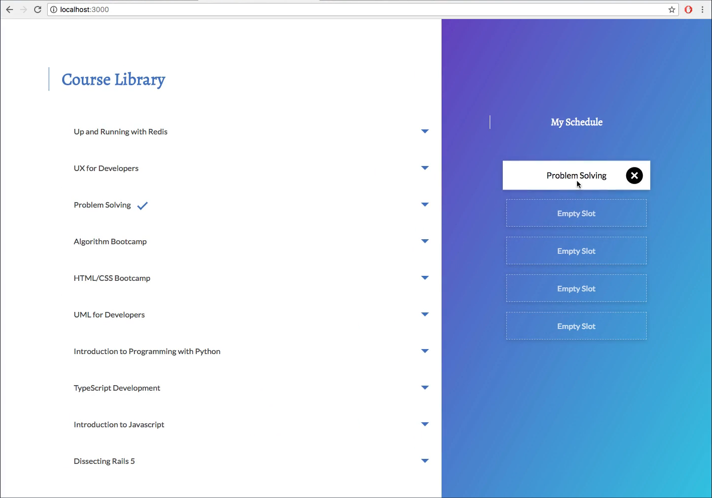
You see here the X button or the remove button on our courses and our schedule component.

So the way we can do this is pretty simple. All we have to do is basically copy these styles so in our schedule.js we have our remove course right here.
renderCourse(course) {
        return (
            <div key={this.state.enrolled.indexOf(course)} className={`slot ${course.enrolled ? 'slot__course' : 'slot__empty'}`}>
                <div>{course.enrolled ? course.title : 'Empty Slot'}</div>
                <a className={`action slot__remove`} onClick={() => this.props.removeCourse(course)}>remove course</a>
            </div>
        )
    }
Let's start by removing the text remove course from the a tag and we don't want that, and then we have slot_remove here in the a tag as well. Now what we want to do with slot_remove is we want to access it here in our courseLibrary.css and eventually we will move this to our schedule.css but for now we're just going to put it in here because our mixin comes in after these styles load and so we have to use it in here for now. So let's type out slot_remove and basically we want to @include add-button;. All right, and now if we add something here you'll notice we can't really see anything but you can see the plus in there.

So what we want to do now is we want to give this display: inline-block;in our .slot_remove, and the reason we want to do that is so that we can see it. So you'll see that it has now appeared and we can see it in our in our button here.

So the way we can get it over to the right now is using a similar technique we used to position it in the first place and that's by saying position: absolute; and then we wantright: 0;`. So let's see what that looks like.

And it's right down here. Now we want to center it and before we center it we actually want it to be a little bit away from the right. So let's look at our design and inspect it, you'll notice this is about 13 pixels away from the right. So we're just going to go with 13 pixels so 13 pixels and that should be good.
Now the way we can get it centered up here is by basically saying OK we want the top to be 50 percent and that should be good right? But it's going to be a little bit too far down, and that's because it's doing exactly what we're saying, it's going down 50 percent. So it's at about halfway. So we have to go up about 50 percent of the height of this to get around the middle and we can add that on our on a transition by saying transform: translateY(-50%);. I noticed that we want this to be rotated so let's just add that into our transform. So rotate 45 degrees and we're looking good now.

That's exactly what we want and that should be it for that. You'll notice that it's pretty much exactly where we want it, if we go to the design and go to a preview mode, you'll see it's right there.

We've just added a cool transition on top. Awesome that's working so that's it for this guide and let's see what we have next in our main.css we wrote down some things. The next thing we're going to get into is the progress tracker component which is what you see here in design right here.

So we'll start off by just adding in the functionality with redux and then we will style it immediately after and then we will be done with that component. You'll notice when we hit add it will go up about 20 percent and it goes up all the way when it adds all of them.

So basically it will go up 20 percent every time we add a course so we can see what percentage of our course we have filled out. So I don't know how many guides that will take but we will take as many as we need to finish that off. And then after that we will take a guide to throw our course options here into its own component.

And then after that we'll do our enrolled component and we can get rid of this fix tiles when we factor those can go on the same one so we'll fix up our styles and refactor, just kind of polish things up, and then we will deploy to Heroku so we can have this have our apps live on the internet.
We need to commit our code so git status, git add, git commit -m "added remove course from schedule style". All right git push origin master and I'll see you in the next guide where we will get started on the progress component.