- Read Tutorial
- Watch Guide Video
So to start off just head to your courseLibrary.scss file, and in this file we want to animate this transform right here. So the way we can do this is simply by adding a transition to our add button mixin right here. So transition: all .3s ease; to the add button mixin.
@mixin add-button {
    background-color: black;
    font-size: 16px;
    height: 32px;
    width: 32px;
    border-radius: 16px;
    position: relative;
    transition: all .3s ease;
}
So that's going to be included in our .course_add and our .course_remove.

So when it goes to .course_remove it's going to transition. It's going to ease into a 45-degree rotation. And when we go back to add it will ease into a zero degree rotation. So if we go to our app and click that you'll notice it doesn't work. And the reason being is because in our courseLibrary.js we have two different a tags here, so it's hiding this first one and then displaying this second one.

So it has nothing to animate because it doesn't start at anything. So the way we can fix this is by getting rid of this just comment the second one out and in our course.enrolled. Let's get rid of the show content and high content and instead let's put course add because if we're not enrolled we want to be able to add it and then if we are enrolled, we want to remove it so course_remove save that head back to the app and the animation should work.
But it should break if we hit this again. Yes it doesn't work over the console and it doesn't say anything but the reason this isn't working is because we're trying to add this course again because onClick is still set to this stuff.

Okay, so the way we can change this is doing the same exact thing we just did with course.enrolled. So let's go ahead and cut this.props.addCourse function call out of our arrow function that is being returned to our onClick and let's say okay if course.enrolled then we want to be able to remove it so this.props.remove(course) and if we're not enrolled we want to be able to add it.

So if you save that and you open up the browser you'll notice that it works now and it says that this.props.removes is not a function.

That's because it's not, we need to change this to removeCourse. But I might as well kind of show you this now so you understand how map dispatch to props works a little bit not to take your focus off styling too much but this is a good example. So I'm saying this.props.remove but down here it's called removeCourse.

We could actually rename this to remove and it still dispatching removeCourse and it still would work because we're calling this function(remove) which is then dispatching this function(removeCourse) which is our action so we can ignore that but it should work with that. Yeah, so that's all set now. You can click the plus sign and watch it spin every time you click it.
Okay so this is our animation it's really nice looking it's a lot better than what we had before but we can make it a little cooler and that goes back to these tags in our courseLibrary.scss we uncomment these and then comment this will get a lot cooler animation.

So it doesn't animate and that's because we need to move our transition into the before and after so we're transitioning these and not the entire button because we're no longer rotating the entire button, we're rotating the before and after content.

So now if you go in you'll notice it animates in the opposite direction. If you think about it for a second you can see that we could probably do this a little cooler, so if you have 45 degrees. We wanted to rotate 45 degrees but if you add 45 degrees that would be a straight line. But if we change this to -135 that gets us a pretty cool spin.
Which I think is cooler than just the regular turning animation. But you can put whatever you prefer, feel free to go back and change the code and learn a bit more about how that animation works. But I personally think this one looks better, so that's how you do these animations for the plus and minus.
We have our check marks going in and out which is really nice, then we have our X's going in and out. Let's go ahead and stop the guide here. And in the next guide we will get into the same button for our schedule. So it's appearing to the right here like we have in our design.

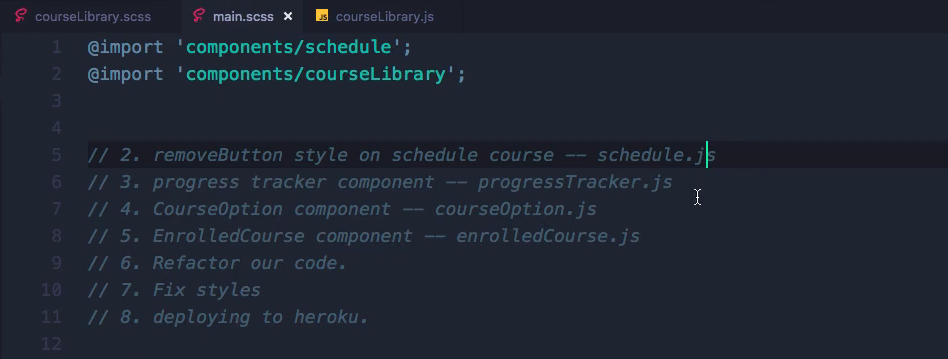
And then let's see what we have on our list in main.scss.

After that we'll get into our progress tracker and then we will basically make our courses here in each of our components into their own components. And then we will fix a few things up and deploy to Heroku and then we will be done with this app so we can move on to the next.
So let's go ahead and say git status, git add, in our terminal here, git commit -m "added animations to course remove and add buttons", git push origin master and I will see you in the next guide.